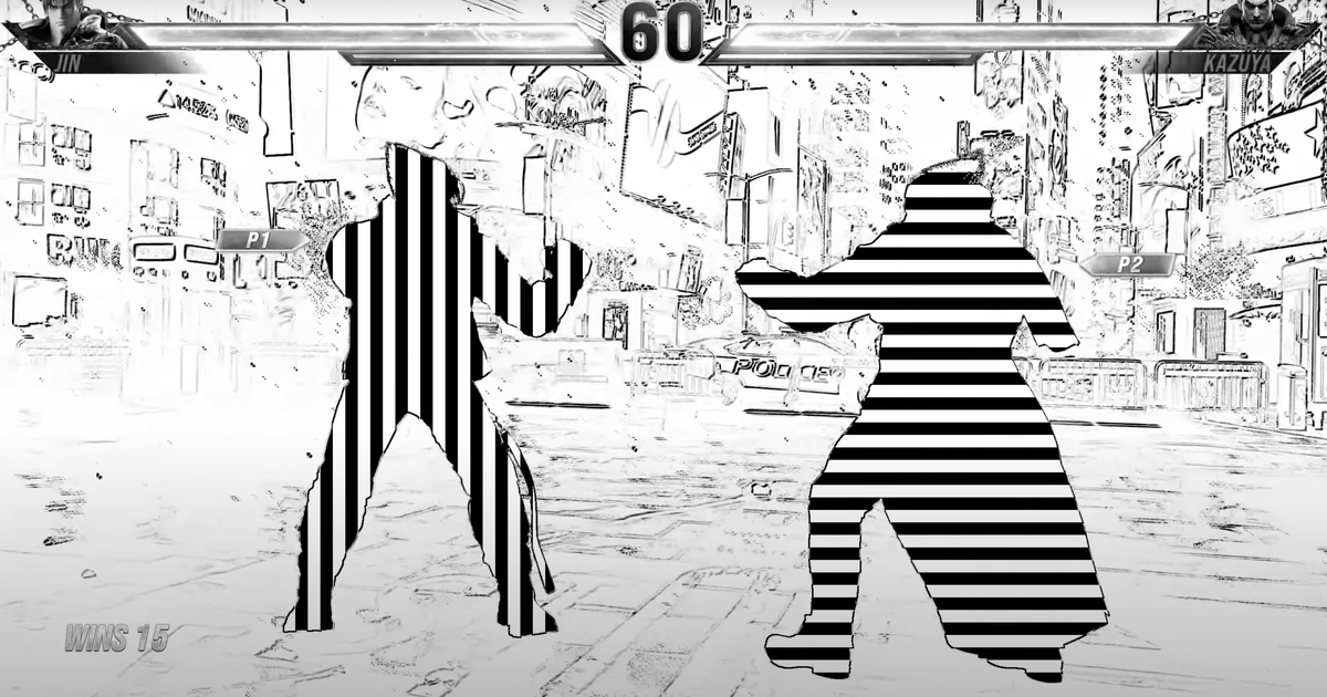
I’m not an expert, but the purpose of this filter is for people who are all but blind. And while it definitely looks trippy, it makes sense. Black/white is the highest possible contrast, which is important for people who, y’know, can’t really see that well. And the stripes are anchored in place, the character outline just moves over them, meaning that so long as someone can see the difference between the vertical and horizontal stripes, even vaguely, it’s difficult for them to lose which is which when everything is moving since the pattern never moves

I’m not an expert, but the purpose of this filter is for people who are all but blind. And while it definitely looks trippy, it makes sense. Black/white is the highest possible contrast, which is important for people who, y’know, can’t really see that well. And the stripes are anchored in place, the character outline just moves over them, meaning that so long as someone can see the difference between the vertical and horizontal stripes, even vaguely, it’s difficult for them to lose which is which when everything is moving since the pattern never moves